Alvi’s Drift
Romantic & Evocative
Yesterday’s legacy, today’s taste.
A rebrand that bridges generations—bold, elegant, unmistakably Alvi’s Drift.
The Challenge
Alvi’s Drift had a legacy worth preserving—but a brand identity that wasn’t doing it justice. Once positioned toward a more traditional, value-driven market, the brand had since evolved, winning international awards and refining its offering. Its audience was changing too—attracting a younger, more discerning generation of wine drinkers. The visual identity needed a complete overhaul. Not just a facelift, but a full recalibration to bring the brand into a more premium, modern space—without losing touch with its roots.
The Insight
With elevated wine offerings came elevated expectations. The brand couldn’t continue to look like the past while competing in the future. But in the world of wine—where legacy matters—change had to be thoughtful. We didn’t want to disrupt familiarity; we wanted to reframe it. This rebrand was about nuance: honouring the rich history of Alvi’s Drift while making it relevant, resonant, and visually magnetic for today’s market.
The Execution
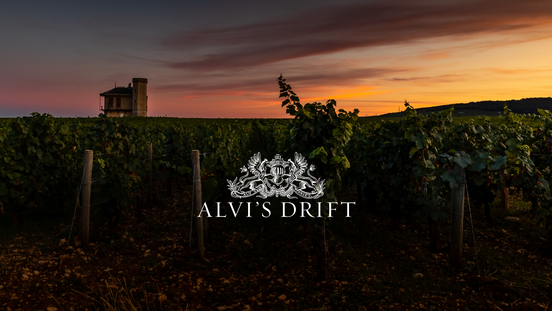
We built a sophisticated visual identity system grounded in the colours of the vineyard—deep, regal purples and reds for heritage and richness, balanced with fresh seasonal hues like peaches and soft blues to reflect the vibrancy of the sparkling and lighter varietals. The font pairing—Moriaty and Metropolis—struck a balance between approachability and quiet elegance, giving the brand a timeless but refreshed voice. Imagery focused on storytelling: wide open farm landscapes, textured wine pours, and candid moments of enjoyment. Even the logo was refined—subtle tweaks that retained its recognisability while elevating its design integrity. It’s a rebrand that doesn’t shout, but whispers confidence with every detail.

We celebrate life as a matter of choice, not chance.


