Ina Paarman. Honouring a legacy. Making it feel like home — again
Reimagining a household icon for a new generation of homes.
South Africa
Taking a beloved South African staple out of memory lane and into modern homes — without losing its soul. Ina Paarman had earned trust over generations, but its story had grown quiet. The challenge wasn’t reinvention.
The Challenge
Refresh a beloved South African heritage brand without losing the trust of the generations who built it. Ina Paarman had long been a staple in South African homes, especially among older consumers — but it risked being left behind by the next generation of cooks, parents, and families. Our challenge was to evolve the brand for modern South Africa: not by reinventing it, but by reintroducing its heart to a new audience.
The Insight
Strong families — like strong flavours — don’t happen by accident. They’re built over time, through care, consistency, and love. Ina Paarman had always understood this. Their real role wasn’t just in kitchens, but in homes: as a quiet enabler of connection, character, and comfort. We realised that the brand’s true equity lay in its emotional presence at the centre of the household — where stories are shared, values are passed down, and food brings everyone together.
The Execution
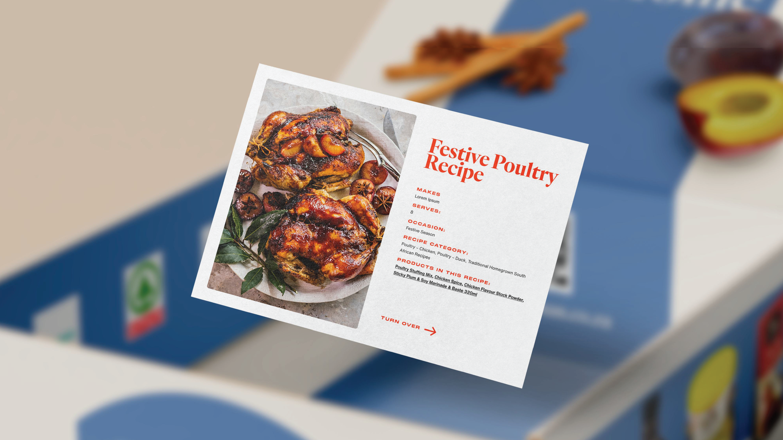
We built a modern visual system anchored in warmth, authenticity, and emotional truth. Inspired by the vibrancy of real ingredients, our refreshed colour palette brought life and energy back into the brand. Typography struck a balance between tradition and modernity, honouring the legacy while embracing the future. Photography moved away from overly polished styling and leaned into real family kitchens — messy, honest, and alive. Design became more human, prioritising the family unit over the food, while still celebrating food as the binding force. The result: a rebrand that feels lived-in, loved, and ready to meet the next generation exactly where they are — at home.

Home-cooked never travelled this well.