Deposita
International
Not just rebranded—repositioned
2020 changed the world as we knew it. It also happened to coincide with a long-term plan of G4S Deposita, which included the redesign of their cash handling device range. Over time, through acquisitions and growth, G4S Deposita’s visual and strategic identity had become disjointed. They needed an overhaul to consolidate their image and better present their technology offering to the international market. The challenge was how to set themselves apart from their holding company, G4S, and how to align their image with the cutting edge technology they create.
The Challenge
As a former sub-brand of G4S, Deposita had long been seen as a traditional hardware supplier—reliable, but outdated. But the brand had grown. Its products had advanced. And more importantly, its vision had expanded. Deposita wasn’t just selling machines anymore—it was powering entire cash ecosystems with integrated software and smart data. The brand needed to break from the past and reintroduce itself as a modern, tech-forward solutions provider built for the next era of financial management.
The Insight
The market was shifting. Customers weren’t just looking for machines—they were looking for end-to-end partners who could offer innovation, intelligence, and security. Deposita had already invested in evolving their offering. The real challenge was aligning their visual identity to match. This wasn’t just about looking sleek—it was about building trust and showing authority in an industry where confidence is everything.
The Execution
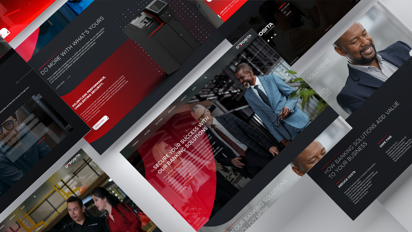
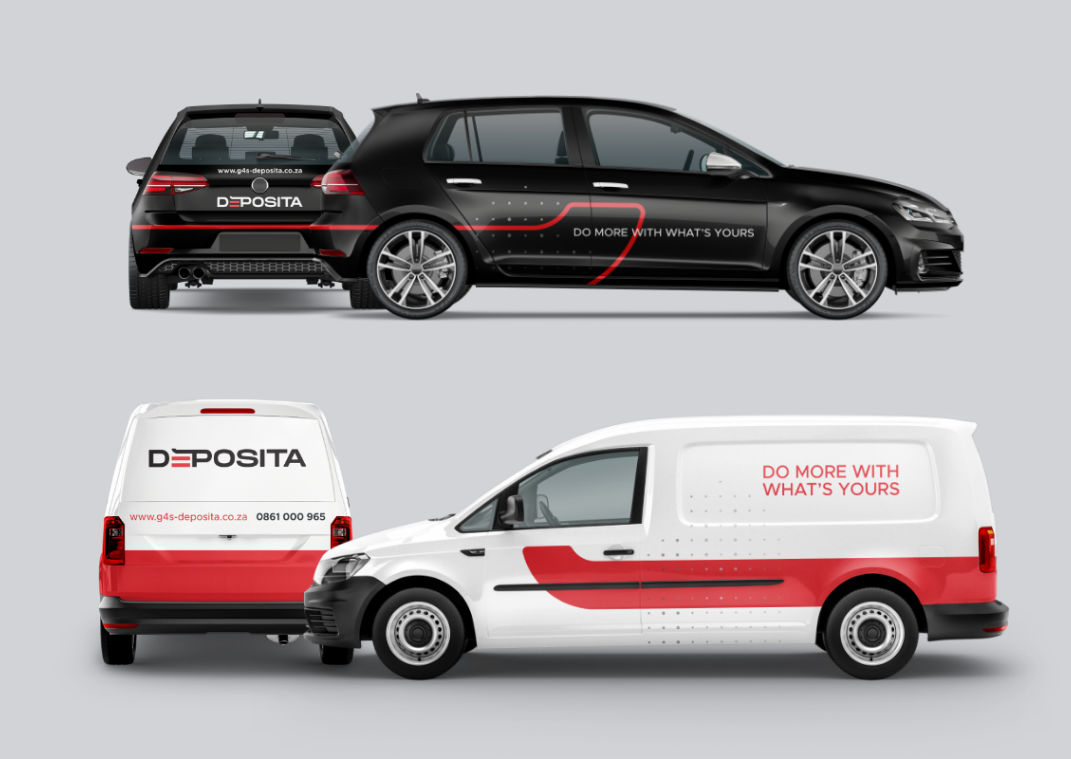
We designed a bold, confident identity system that captured both strength and sophistication. The new logo subtly referenced the cash entry point in their hardware—cleverly worked into the “e” of the Deposita wordmark, tying form to function. A modern colour palette of charcoal, tech blue, and a hint of red established credibility and aligned the brand with digital-first thinking. Typography was bold and grounded—built to reflect a brand you could count on. To balance the technical with the human, our imagery highlighted real people and real environments, showcasing the broad spectrum of customers and industries Deposita serves. And to signal the digital shift, a subtle red gradient band was introduced—an understated but effective nod to the evolving tech-forward landscape the brand now leads.

Protecting People From the Dangers of Money


-
![An image of Greenspacing.]()
01
-
![An image of Greenspacing.]()
02
-
![An image of Greenspacing.]()
03
-
![]() Description goes here
Description goes here -
![]() Description goes here
Description goes here